I have great timing on baby nurseries. I finish them just as the kid learns to crawl, which necessitates the removal of half the decorative items, due to baby proofing measures. Eh, I’m willing to live with it.
Emma’s room isn’t quite finished actually, and I could use your thoughts and advice.
The puzzle: This large, weirdly shaped wall.
Sorry for the awful photos - I’m convinced my camera is on the fritz. I’ve probably dropped it too many times.
Here is a larger view to get a better understanding of what the room currently looks like. Back when Ben inhabited this space, the wall was home to a large tree decal. Which was great and lasted a long time but was eventually picked off by the aforementioned child.
Let’s talk design for a minute.
The theme for this room is bright, bold, and colorful. Think sunshine yellow and rosy corals, with the crib, chair, and dresser being a nice ivory. So pretty much anything flies.
I would love to put a giant painting or photograph on that wall and contemplated doing a b&w photo on engineering paper (like this). But in the end I couldn’t decide on a photo and wasn’t sure how I was going to frame the darn thing, given that professional framing = mucho dinero.
I started digging around in my craft room and came across some old prints that I’d stored a while back and decided that a collage could still give that big visual punch but also wouldn’t break the bank.
As much as I profess to love the clean, sleek lines of modern design (I do, truly!), I think I’m a bit of a clutter hound when it comes to artwork.
More is better, right?!
At least I’m true to myself. Here is a shot of my room in high school:
I had a huge fan girl crush on a professional windsurfer named Kevin Pritchard. Somehow I skipped the Backstreet Boys and InSync and went straight for the surfers. I just about keeled over one time when my dad got back from a trip to Hood River (Oregon) and reported that he’d eaten dinner one table over from this guy’s (equally famous) brother. So close!
Anyway, this was one wall in my room. Eventually I also did the entire ceiling in a similar fashion (with staples, no less!) when I was procrastinating on a final paper. Sorry about those staples, parents. I’ve always felt bad about those.
I also had a similar b&w version in my college dorm that I’m pretty sure my roommate hated. She called it my clutter corner once and I remember feeling highly insulted.
But I’ll concede she wasn’t far off in that assessment.
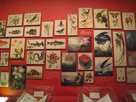
Sorting through our folders of photos on the computer I ran across a few additional examples. Here’s one that was absolutely stunning. This collection of antique biological prints was mounted on the walls of the Huntington Library in Southern California (a must-visit place, by the way. It’s a terrific venue with gorgeous gardens).
Our guest room headboard is also a collage that I did a few years back.
Never underestimate the power of Mod Podge, lovelies!
Never underestimate the power of Mod Podge, lovelies!
So that brings us back to Emma’s room. Let’s face up to a few facts:
1) I love collages
2) but worry about covering a large wall in small images. There is already a lot going on in this space.
So here’s a trial run (temporarily held in place with washi tape). What’s your take? Too much? Cute? Pretty? Eyesore? I’d love to hear your opinions.
Don’t worry about the crooked nature of many of the prints, this was just a quickie mock-up.
And here are some larger photos of the room for perspective:
And the other side:
All of these photos are available for free online (many in public library archive collections) and I had them printed for about $10 at our local printer.
My tastes tend to run in the travel, adventure, animal, and quirky directions. We parents don’t exactly take an impartial stance what our children should choose as hobbies, do we? :)


Alternatively, if I printed out a b&w photo on engineering paper, I could probably mount it inexpensively on poster board and build a very simple frame around the outside.
Bear with me, folks. Here are a few top contenders for a single b&w photo print. Thoughts?
Animals. Places.
Alternatively, we could do old baby pictures of us (chris, left. Sonja, right. Ben below. This seems slightly weird, however). Is it just me?
Here are a few mock-ups:
Bear with me, folks. Here are a few top contenders for a single b&w photo print. Thoughts?
Animals. Places.
I’m kind of partial to the one of my mom pulling her brother’s ears on Halloween. Or my beloved dog. That’s my papa in the crew shell in high school and me (as a toddler) with him when I was about three.
Alternatively, we could do old baby pictures of us (chris, left. Sonja, right. Ben below. This seems slightly weird, however). Is it just me?
Here are a few mock-ups:
Well now. What do you think? Thoughts? Suggestions? Love it? Hate it? Do tell.
xo,
Sonja


