My Lovelies,
Do you remember back to when Ben only took up this much room in his crib?
It was about a year ago.
He'd come a week early and we were still scrambling to get his nursery set up. We had the basics: crib and changing table but none of the fun stuff like artwork. We wanted to fill the space above his crib with a montage of family photos.
Then I arranged the paper piece on the wall to get a satisfactory arrangement:
Ultimately, I decided I wasn't comfortable having that much wood and glass hanging above my baby's head whist he was sleeping, despite purchasing earthquake proof hangers:
Which are only as strong as your walls. Which is great except that we have touchy plaster walls.
We tried it on the other wall but decided it was too much, as his giant tree mural-thingy was in the way.
So, where does that leave us, you might ask?
Good question.
Well, the hallway suddenly began to look like a promising option.
Here is a quick peek:
The walls between Ben's room and the Guest Room looked like a good size and were in a fairly out-of-the-way spot. We thought about putting them in the main hallway but that wall is a) vast and b) frequently used. We imagined the bambino grabbing a hold of frames as we toted him down the stairs.
There were a few other walls that had potential but ultimately we decided they were too small. So this wall became the winner:
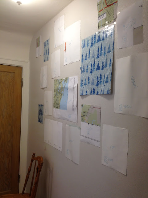
I saved the original paper place holders and we put them up yesterday is a very similar configuration.
Here is a close up of our paper place-holders.
Here is a close up of our paper place-holders.
This nifty little drawing denotes that it should be hung as a portrait, not landscape.
And the canine version:
Oh yeaaaah, I've got mad artistic skills, Peeps.
The ceiling of the guest bedroom is sloped, thus the door swings out into the hallway. We wanted to avoid hanging pictures in a spot that would get banded by the handle. Hence the tape.
And here is a quick mock-up:
This is actually the hardest part: finding a layout that works. We have a few things to consider: a) it needs to look good, spatially, right now and b) you need to have room to add new family members. I have a feeling that we'll add a few people here in the next few years and I need room to hang their portraits (hopefully by their spouses or parents).
Also, I haven't decided what I'm going to do in the event that we lose a family member. My grandpa is 100, and scheduled to turn 101 here in a few months. But he won't go forever. Should I take him down after he dies? Leave him up for a few months? Drape his portrait in black cloth?
[kidding on that last one].
I don't feel like I should leave it up indefinitely as I didn't include family members that have already passed away. I suppose this is a bridge we can cross when we come to it.
Stay tuned for frame painting (the avocado green is out!) and hanging.
Peace,
Sonja


